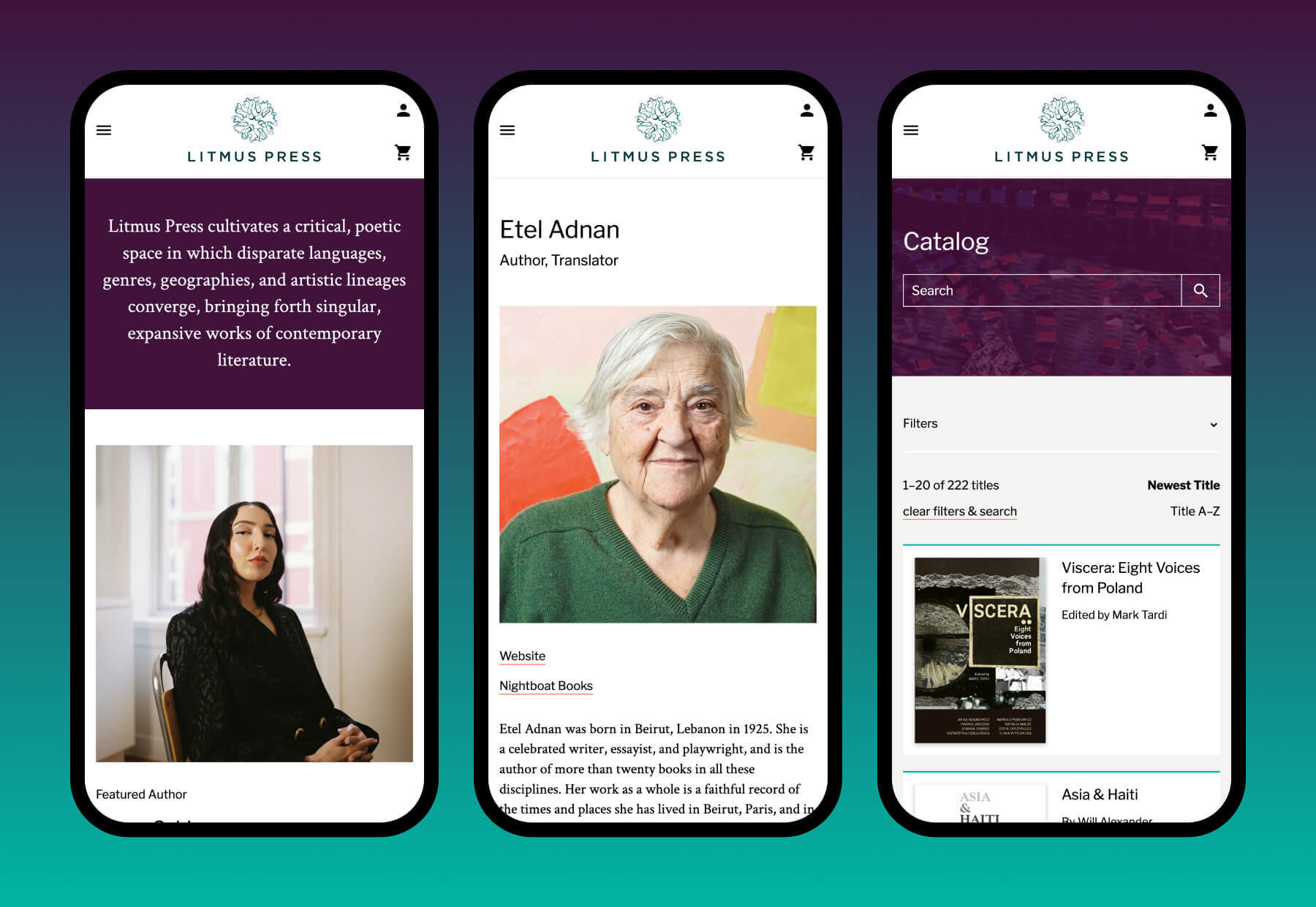
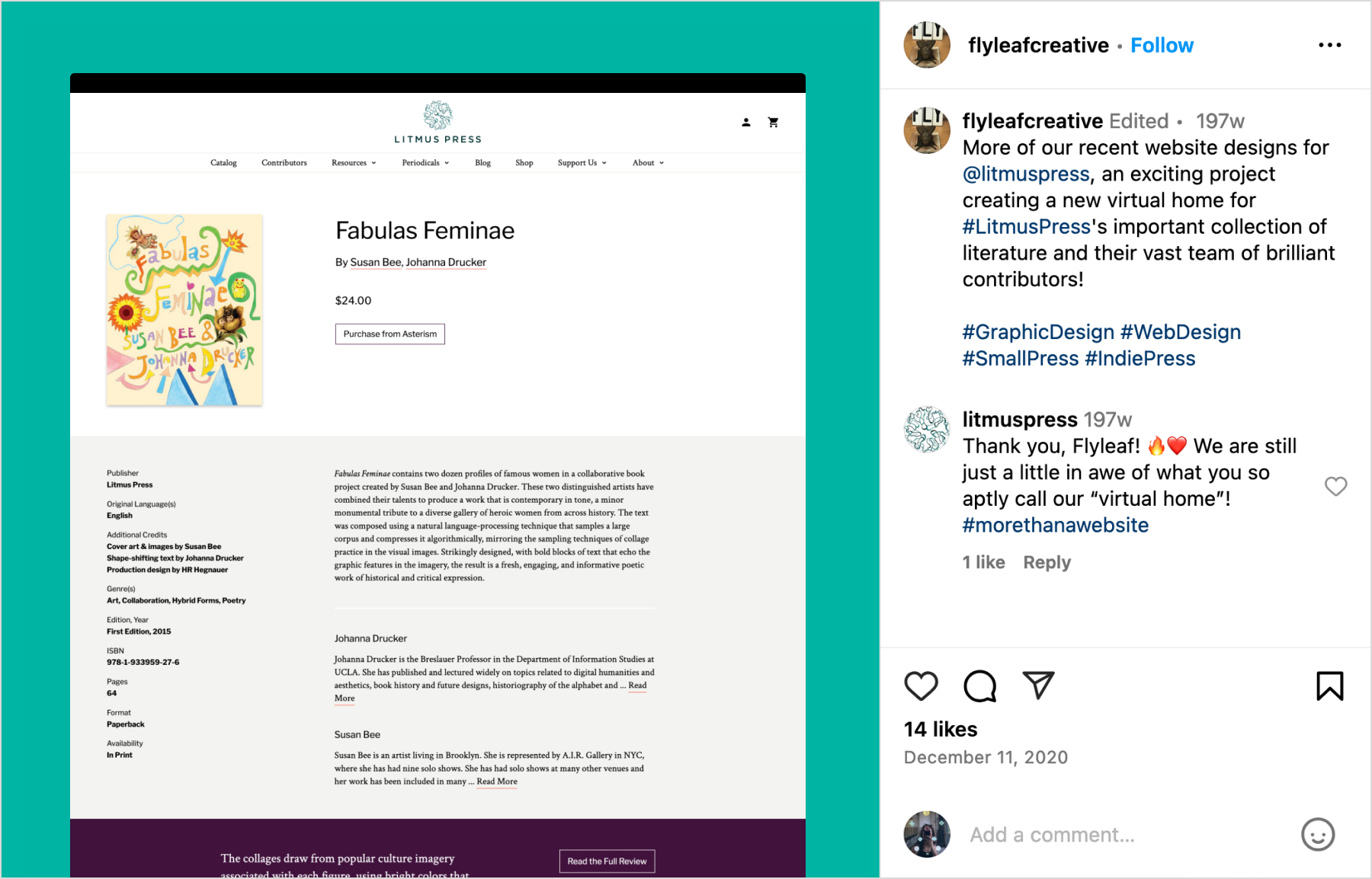
Litmus Press Website
Litmus Press is a small press publisher with a multidisciplinary and feminist focus. They also manage and distribute titles from two other presses — O Books and The Post-Apollo Press — and asked Flyleaf to design a new website that would bring these entities together in a single catalog.
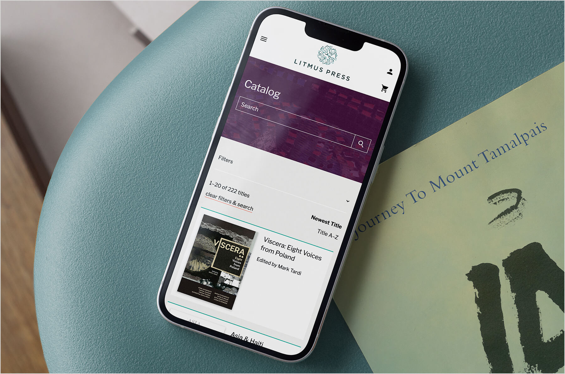
I led the design of the new site, working closely with the Litmus team and our web development partners. We combined (while distinguishing) the three catalogs, incorporated clearer calls-to-action throughout the site, and brought Litmus up to speed with responsive design.
What I did:
- UX/UI Design
- Visual QA
Who I worked with:
- Flyleaf Creative (Agency)
- Litmus Press (Client & Content)
- Medium Rare Interactive (Development)
I started the redesign by taking an inventory of the publisher’s three sites, detailing the existing content we would need to bring together in the new site.
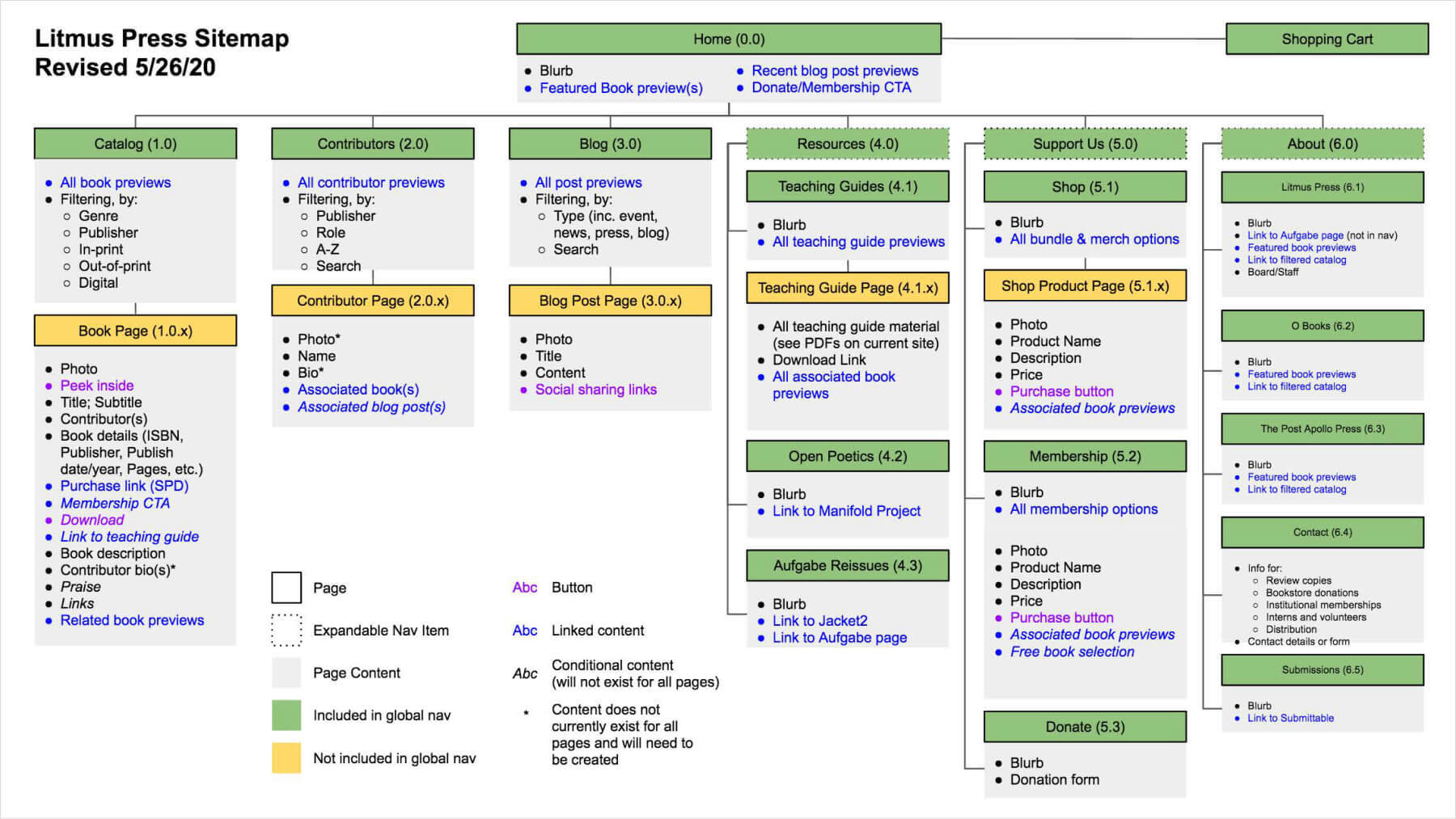
Using my content list, I created a sitemap to accommodate and organize all the content, existing and new, that Litmus wanted to feature.
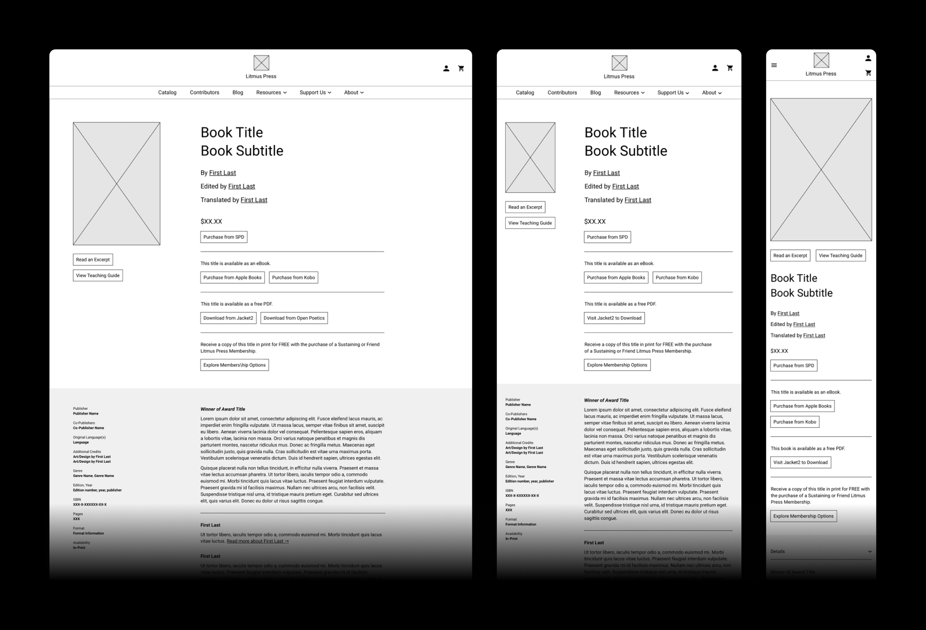
Then, I started with wireframing, beginning with the most complex page: the book page.
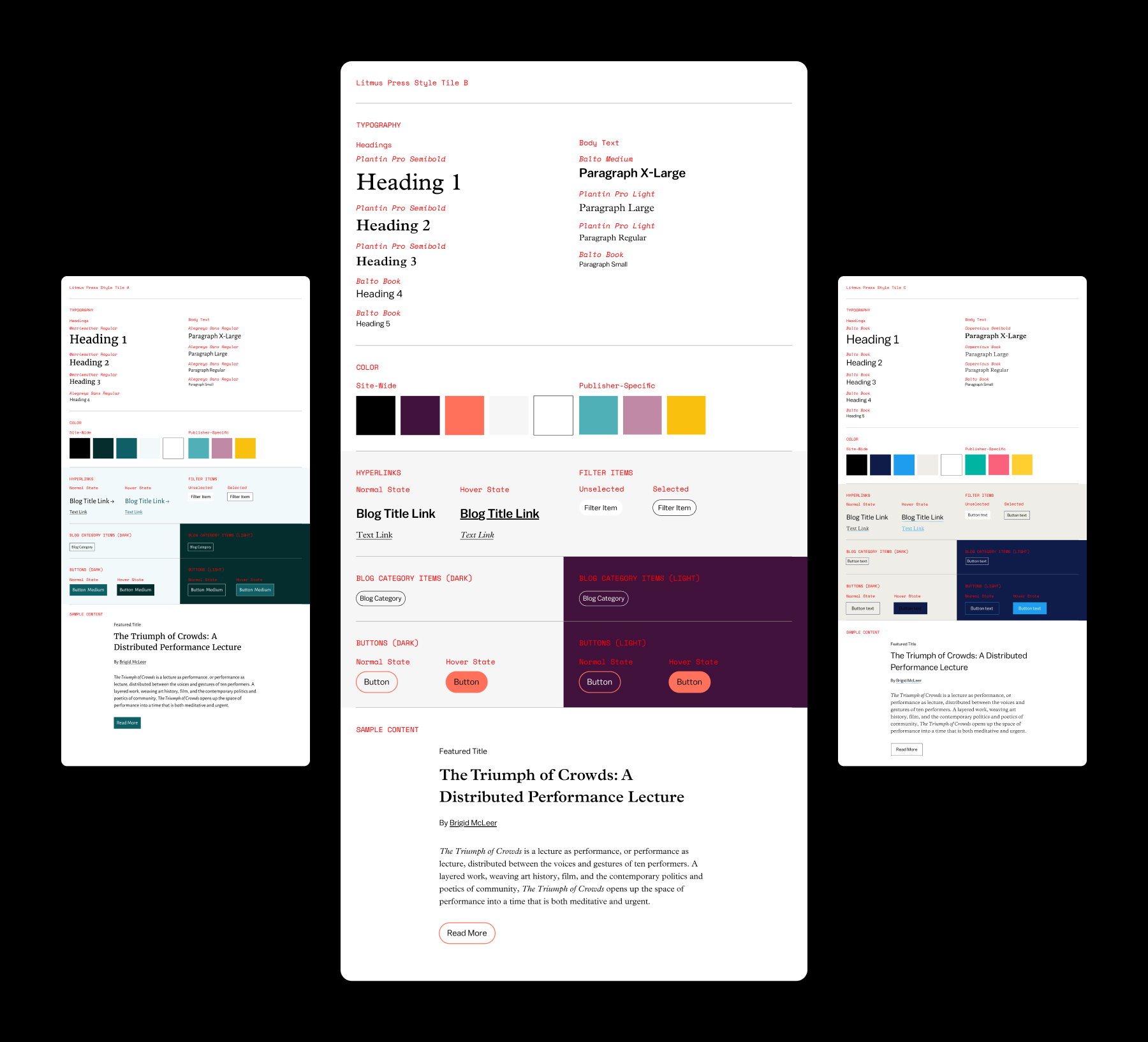
Next, I worked with Litmus to explore typefaces and colors for the site, and we quickly reached a decision on a proposed style tile.
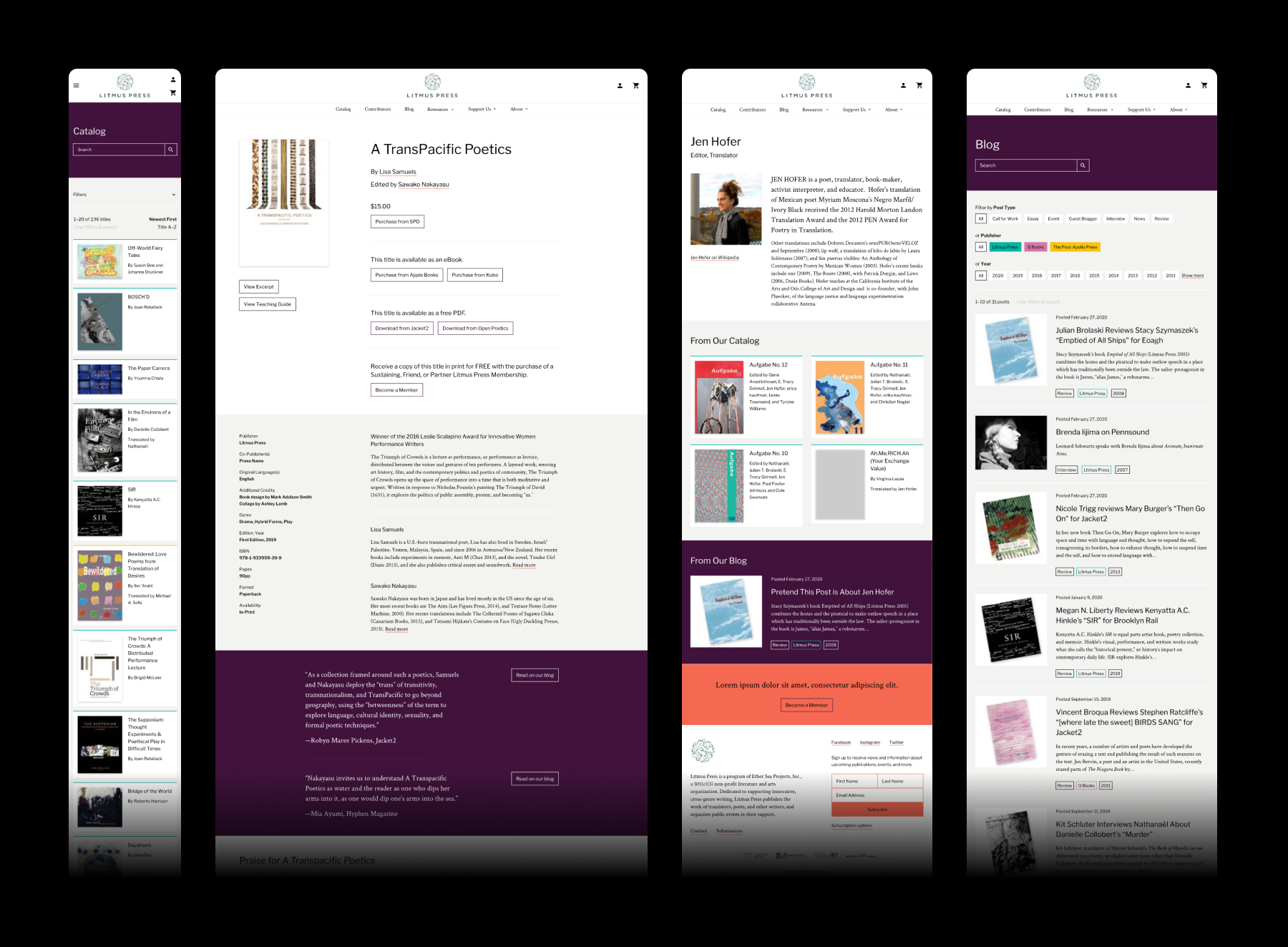
I styled all of the wireframed pages across various device sizes, and sent them for a final review.

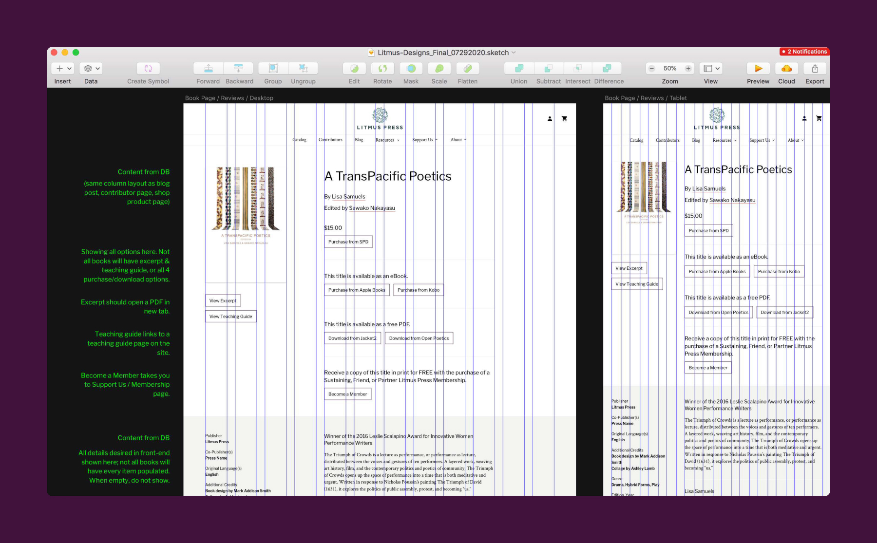
With approval from the client, it was time to prep and annotate the files for developer hand-off.
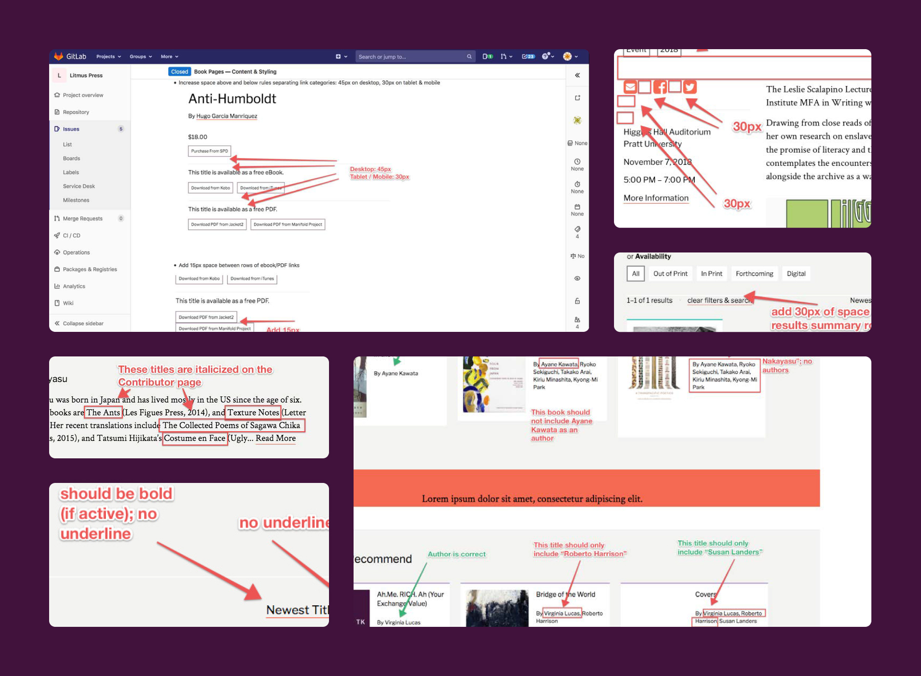
Throughout the development process, I conducted visual QA, working to ensure that the site met the design specifications.
As the developers polished up the site, I worked with Litmus to train them on entering and updating content on WordPress. After everything came together, Litmus was ready to publish its latest work to the public: a brand new home for its expansive literary catalog.
